Through a partnership with Burlington City Arts, the UVM Medical Center features artwork by Vermont artists on the main medical center campus.
Throughout the Medical Center, locations of the work are next to the artists’ names in the listing below.
111 Colchester Avenue
(802) 865-7296
Art Map Burlington #51
12/15/17-4/15/18
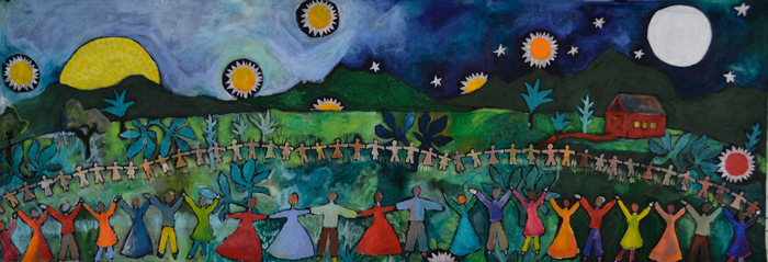
The work of Joy Huckins Noss, Nils Johnson, Gabriel Boray, Tom Cullins, Caleb Foster, and Will Gallup. Curated by BCA.
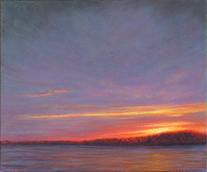
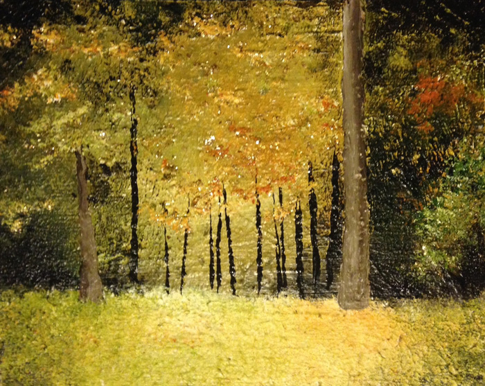
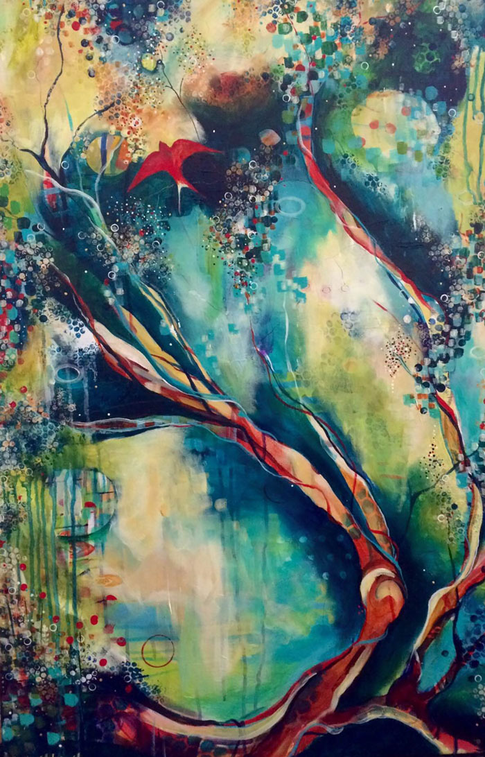
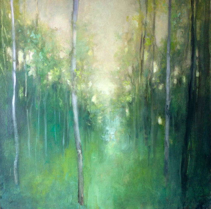
Joy Huckins-Noss is a contemporary artist whose love for nature is seen in her vibrant canvases. Joy’s paintings feature tiny spots of color which combine optically. Her style is similar to pointillism, but has a fresh contemporary edge. She applies color in multiple layers to create a uniquely textured surface of color and light.
Joy began her art studies at Drew University, and then continued at the University of New Mexico, earning her BA in art. Joy participated in two residencies at the Cape Cod School of Art in Provincetown, where she studied painting in the tradition of the Impressionists. Joy has studied with other notable landscape painters such as Wolf Kahn, Don Stone, Charles Sovek, Doug Dawson and Ray Roberts. Today Joy resides in Vermont and spends the winter months in Arizona, creating art in both locations. Joy’s paintings focus on our relationship with the natural world. Landscapes of trees and bodies of water, plants, and objects found in nature, draw viewers into a deeper relationship with our environment. Joy’s art relies on the perceptive ability of the eye and mind of the viewer to mix the color dots. Her surfaces are rich, intense and seem to vibrate. “I love to work with the color to make the paintings glow. I want to bring the feelings and sensations of being outdoors into the painting”. (image: Before the Night (20″x24″; oil on canvas))
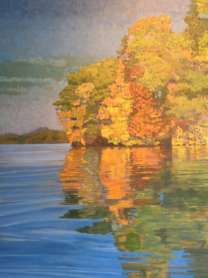
My painting is about color. I employ stacks of associated colors that breathe through each other to create a vibrant, textured surface that is fun to investigate. I start by creating what is essentially a color negative, the under-painting. To determine the proper color for the large masses of the first layer, I stare for 30 seconds at the color I want to end up with and then gaze with unfocused eyes at a white sheet of paper. A “ghost” image appears—for instance, a ghost cerulean blue shows up, having stared at a cool red. A grove of pines in full sunlight start out dark brick red; yellow aspen begin their graphic life violet. By allowing the under-painting to peak through by not completely over-painting, the eye blends the push-pulled colors, lights and darks, and places objects in space in a fascinating and unique way.
A second concept: The most effective paintings, the ones that sparkle and catch your eye contain warms, cools and earth tones. They also have light lights and dark darks. (There is nothing worse than a “flat” painting.) Shadows hold cool purples and blues, as well as warm darks. Brighter passages hold warms, but also subtle cools. Paintings are not photographs. A landscape must show, not what is there, but what the artist feels about what is there. I show my passion for life and art by creating exciting paintings with stacks of complementary colors, salt and peppered with warms, cools and earth tones—with plenty of value contrasts between them. (image: Connecticut River Bend, Fall (40″x30″))
Gabriel Boray
Gabriel Boray is a 45-year-old painter living in Burlington.
My childhood passion for painting, drawing, and photography led me to the profession of architecture which I practiced for over 40 years, both in the United States and overseas. Throughout this career, painting and photography continued to be integral to my exploration of form, light, detail, and composition.
My aesthetic direction in both of these pursuits has always ranged from representational to purely abstract, responding to the light and character of each location and culture. The joy of painting in Greece for over 30 years, mainly as a watercolorist, has allowed me to explore negative space and cubistic composition through its extraordinary light. Lately, I have used my background as an architect to explore more abstract composition, color, and complexity in my painting and photography, and, most recently, sculpture. Finally, there is often the thrill of an unanticipated image that develops magically during the creative process of painting or shooting a photograph.
For me, creativity has been vital and is the spirit that keeps my life invigorating and exciting. Since retiring from my architectural firm, I have intensified my experimentation with painting and photography. I also continue to travel to Greece each summer where we have a home on the island of Kea. (image: Gihon River (31″x25″))
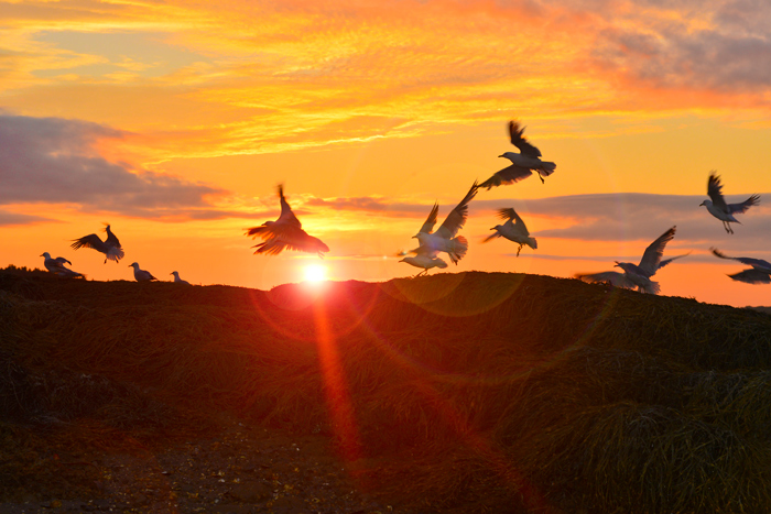
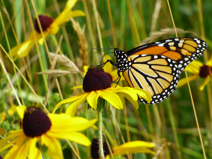
Caleb’s life experiences have shaped a dynamic, multi-cultural perspective that is actively portrayed throughout his photography and artwork. Born and raised internationally, but now based in Jericho, Caleb loves capturing the amazing details Vermont has to offer. He continues regularly exploring the rest of the globe as well, with his camera always in tow. He focuses on nature, landscape, travel, portrait and snowflake photography. With a profession in the Life Sciences, he enjoys fusing science and art by combining his expertise in Microscopy with his creative passions. (image: Sunset in Lake Champlain (20″x28″))
Will Gallup
My love of nature has resounded through my entire life. I have spent countless hours exploring forests, wetlands and other habitats to explore and document the beautiful array of life that is found there. I was originally driven by a scientific interest and documented many habitats and wildlife behavior with my camera, which was always my companion on my explorations.
I started looking at my photos, not only with a scientific eye, but with the eye of an artist celebrating the wonders to be seen and appreciated. It is such a joy to be able to freeze time with a photo and to share with others the simple wonders to be found in our world. (image by Will Gallup)
August 15-December 15, 2017
The work of Lee Garrison, Susan Larkin, Mike Farnsworth, Olga Verasen, Mike Strauss and F7 Simplicity. Curated by BCA.
Lee Garrison (Rotunda)
A prolific artist, Emily O. “Lee” Garrison (1928–2014) revisited certain subjects–flowers, grasses, water, her friends’ gardens, familiar landscapes–and painted them time and again, each canvas capturing a new emotion, a change in season, or the play of light at a particular time of day. An avid traveler, she captured subjects in places as far-flung as the gardens of Positano and the mountains around Chiusaforte in Italy to the archeological excavation at Sardis in Turkey. Garrison often claimed inspiration from the Chinese artists of the Sung (Song) dynasty, not so much for their style but for their creative process of long meditation and contemplation followed by rapid execution. Color, too, became such a key element in her work that virtually every painting she created from the 1970s on contained a shorthand along the very edges of the canvas, recording what particular paint and colors were used, as well as the specific date/s the painting was worked or reworked, the season, and time/s of day. A close friend and fellow artist once observed that Garrison “studied colors in a systematic way. For as long as I knew her, she had sheets of color references and explorations…Besides being a dedicated, empathetic observer of the energies of nature, she always worked on her sober craft—how to get a color combination just right, with some daring and surprise.” Lee Garrison embraced life and approached her work with a tremendous passion for exploration, life-long learning, people, and nature. Though she lived variously in Boston (her long-time home), New York, Italy, and elsewhere in the world, she spent her summers painting and sketching on the shores of Lake Champlain for more than 30 years. Prior to her death, Garrison made arrangements to leave her life’s work to the Burlington City Arts Foundation (BCA). For the last two years, BCA has been working to inventory, curate, catalog, and photograph thousands of oil paintings, watercolors, sketchbooks, and other items from Garrison’s studio into a collection that now comprises more than 500 digitally archived artworks. BCA is grateful for this generous gift, which, through its sale, will continue to support the arts and regional artists. (image top: Giant Red Hibiscus by Lee Garrison (oil on linen; 1972))
Susan Larkin (BCC)
I paint primarily in and around the Champlain Islands, where I live, with an occasional trip to the east, towards Mount Mansfield and the surrounding farmlands and rivers. My primary motivation is to record the effect of light on land and water. I think of my paintings as expressive impressionism. My paintings are very personal; through them I am trying to communicate what daily life is like living on an island, with the landscape illuminated by the reflection of the lake. I try to communicate what the day felt like to me, the air, the sounds, the light, colors, and conversations with my painting companions. I want to capture what exactly it was that made this view, this day, to shine for me. The magical something that made my mind say, “Look at that!” My attempt is to keep in the forefront that essence of the scene and communicate this through the painting to the audience. As I continue to work on the paintings in the studio, they become a narrative of my memories of that particular day in my life. (image: Emergence by Susan Larkin (12″x24″; oil on linen))
Mike Farnsworth (EP3 & Patient Garden)
Nature is wicked awesome. To appreciate the energies of the natural world and depict inspiring scenes is nothing new. That drive in an artist is probably as old as art itself. To truly commune with nature and go beyond the beauty-into the sense of place–is my goal. Painting in acrylics or oils is such a wonderful medium for expressing my vision. Whether it is a misty autumn morning in Vermont, a crisp 40-below afternoon in the Canadian Rockies, or a warm breezy day on the Atlantic, I place brush to canvas and let the appreciation flow. Sometimes I work from a photo I took, sometimes I set my easel up where I’m inspired. Sometimes it’s a joy, sometimes it’s agonizing, but it is always worth it. In my work I try to honor the gifts I have been given as an artist by balancing my view of the natural world with how it deserves to be seen. I rarely incorporate buildings, roads or other structures, because I feel they distract from the core of naturalism. I hope my work evokes a love of nature, and a respect of place. My highest hope is that it fosters appreciation for what we could lose if we are not mindful of our choices as a people. But I’m happy with “beautiful” too.
Ever since he was a tiny baby strapped to his father’s back and enjoying weekend hikes in The Green Mountains, Michael Farnsworth has known the natural world and felt a connection to places. To this day he searches for places that speak to him, and most often those places are wild or close to it. How he feels above tree line or on at a lakeshore is hard for him to put into words. And luckily he doesn’t have to; he puts that feeling into paint or photographs. Michael’s passion is for the places we live in and the mark we leave on the land. He strives to help people see the importance of place and the gift of living within such a beautiful world. Whether you live in the heart of Burlington, or in a quiet retreat in Stowe, Michael’s artwork calls you home to nature. (image: untitled by Michael Farnsworth)
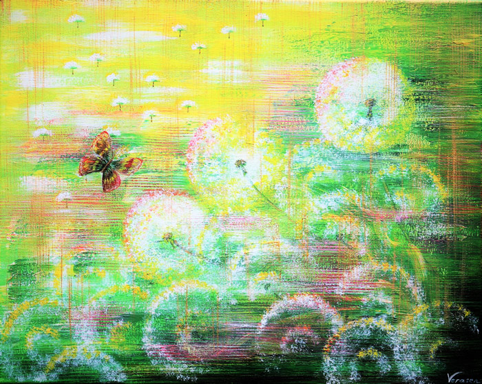
Olga Verasen (Oncology)
Author, artist, developer of “Emotional happiness” programs for kids & parents, including illustrated fairy tales, paintings. I live in amazing wonderful place, South Burlington. This is my Happy Home! When people ask me how I paint, I will answer simply: “I feel color and each painting for me is like a journey in both the outer and inner world”. I can say the same about my books. What are my books and pictures? They are about happiness, about beautiful positive emotions and the ability to fill our life with them. I will be happy if you find on these pages something that adds happy emotions to your life!” (image: June by Olga Verasen (16″x20″; acrylic on canvas))
Mike Strauss (McClure)
Strauss has been painting and drawing since his teens. After forty years as a professor of chemistry he began devoting full time to painting in 2003. His primary interest is in how color and value create the illusion of light and shadow. For example, when he paints landscapes depicting early morning or late afternoon, the light is often filtered by dust or moisture, resulting in a warm red-orange glow. In this circumstance, portions of objects lit by orange light reflect warmth in the viewer’s eye, even if the reflection is from snow. The cooler blue, purple and green shadows in these warmly lit scenes build depth. This is reinforced using linear perspective, which is most evident in the lines of lanes, houses, poles, trees and wires in his street scenes.
Strauss’s work is strongly influenced by the Canadian and California colorists, both in style and subject matter. He is particularly indebted to Mike Svob, Nicholas Bott and Min Ma for inspiration in the subject matter and style of the paintings in this small collection. Like these artists, he sometimes uses bright, bold, color shapes, often with hard and sometimes black edges, to create interesting patterns and design. Though the colors and lines he uses are sometimes not found in nature, the resulting images retain the logic of light and shadow. He often tries to make the brightest objects seem lit from within as well as from incident light, to create an otherworldly glow, like electrified neon in glass. It is this luminous quality of saturated and impressionistic color that pleases him most.
F7 Simplicity Group (Hallway & Connector)
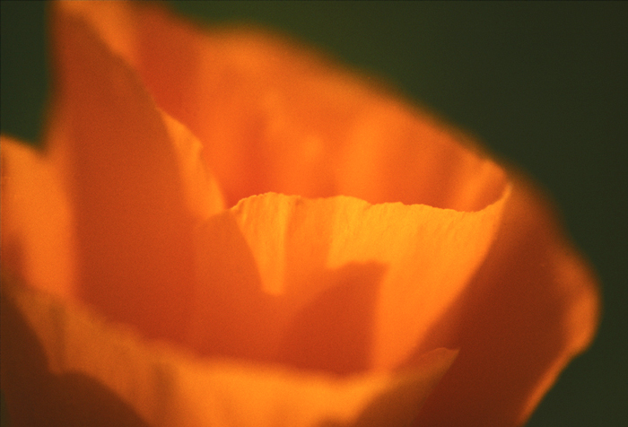
The F7 Simplicity group includes Annie Tiberio Cameron (image: Poppy), Elliott Burg, Lisa Dimondstein, Julie Parker, Sandra Shenk, John Snell, and Rob Spring.
April 15-August 15, 2017
The work of Michelle Turbide, Mary Hill, Kathleen Berry Bergeron, Ken Russack, Jeff Herwood and Kari Meyer. Curated by BCA.
Michelle Turbide (ACC 3 & Mary Fletcher)
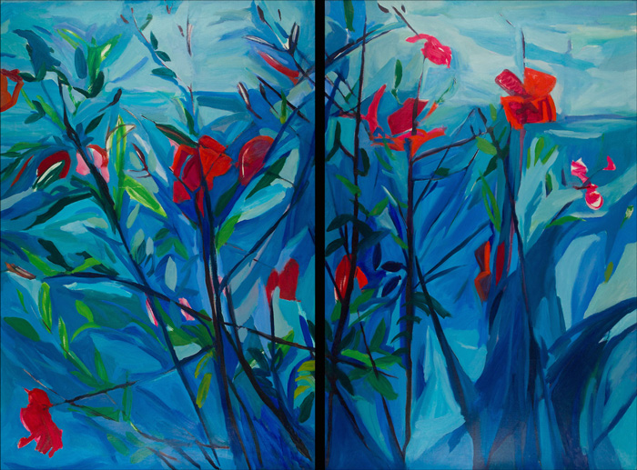
Michelle Turbide’s work is about the transformation of the soul through lived experiences that change, evolve, and grow us. While it could be described as abstract, expressionism, ethereal figurative work, or mysterious dreamscapes, it is really not about what you see in the piece, but about what you feel in the witnessing. Turbide’s intent is for her work to settle into your being and communicate a message that is not always seen or felt at first glance, but subtly speaks as you allow yourself to move into it. Her process involves entering a state of liminal space and collective unconscious and excavating a visual narrative that holds the energy of the experience. She strives for her art to be a journey for the viewer to relate to the emotions, mystery, and depth of the essence behind the piece. (image top: Descent by Michelle Turbide (20″x20″; acrylic on canvas))
Mary Hill (ACC 3)
Mary Hill loves pattern and textile design. The abstract paintings are a way for her to organize color and form in an intuitive way. Her hand moves and chooses paint color. She thinks the abstracts hint at overall decorative design…and then wander into other territory. An adventure into the unknown: She likes that. The landscapes were created when her kids were teenagers. She was working on using a lighter color palette (analogy for “lightening up” herself…”chillax” Mom.) She painted them in response to a challenging few years, adding white to a palette that was usually thick with dark, rich colors. She works with many colors of paint spread out on a tray. She likes using acrylic because of the easy clean up. She works from images in her head: when she sets out to paint something she thinks up a design. What she paints that day depends on how she is feeling. She never has knowledge of the exact outcome of the work. Painting makes time disappear. She feels like she has created a little bit of peace in her corner of the world after she has been painting. (image: Gather Together by Mary Hill (72″x30″; acrylic on unstretched canvas))
Mary Hill loves pattern and textile design. The abstract paintings are a way for her to organize color and form in an intuitive way. Her hand moves and chooses paint color. She thinks the abstracts hint at overall decorative design…and then wander into other territory. An adventure into the unknown: She likes that. The landscapes were created when her kids were teenagers. She was working on using a lighter color palette (analogy for “lightening up” herself…”chillax” Mom.) She painted them in response to a challenging few years, adding white to a palette that was usually thick with dark, rich colors. She works with many colors of paint spread out on a tray. She likes using acrylic because of the easy clean up. She works from images in her head: when she sets out to paint something she thinks up a design. What she paints that day depends on how she is feeling. She never has knowledge of the exact outcome of the work. Painting makes time disappear. She feels like she has created a little bit of peace in her corner of the world after she has been painting. (image: Gather Together by Mary Hill (72″x30″; acrylic on unstretched canvas))
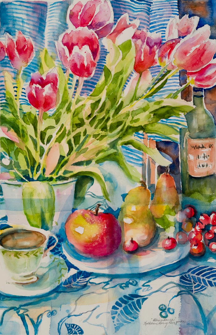
Kathleen Berry Bergeron (McClure 4)
With passion anything is possible. Kathleen Berry Bergeron paints with conviction and anticipation never sure of the final result. This is the excitement in art. She is constantly fascinated finding new and expressive ways to captivate the viewer and make them part of the experience. As she gazes upon a subject, she imagines the different techniques that could be employed to evoke in the audience the same powerful impact that it gave her. Color and value are key in translating her ideas. Her work begins a statement that can be finished by the person viewing it. She always uses quality materials in creating a piece but it is her passion for the process that hopefully is the essential element that sets it apart. “Painting is like a dance partner, you don’t control it but learn to move with it”. (image: Abundance by Kathleen Berry Bergeron (28″x22″; watercolor))
Ken Russack (ACC 2)
Ken Russack started his painting career as a freshman in high school under the tutelage of one of his early mentors, Maynard Sandol. He continued to paint and take classes during his underclass studies at Oswego State. He then took a 30 year hiatus, moved to Vermont, raised a family, and never got rid of his paints. One day he was drawn to the idea of en plein air painting and what became a minor obsession of grasping the nuances and complexities of this new found art. His work was supported by several key individuals including Fiona Cooper Fenwick, Carolyn Walton and Mark Boedges. The paintings on display were painted primarily at the Burlington waterfront and in particular the freight yard. Russack was drawn to this urban landscape and how it subtlety interacts with our daily lives. The train yard offered a bigger than life backdrop which provided him an uncountable amount of opportunities to capture this urban landscape. He also saw the immense presence of the trains and the people that work this business in the heart of our downtown. Russack continues to paint the urban landscape, and the pastoral scenes whenever possible. His style is a compilation of the Impressionist slant, with a bit of Hopper thrown in for good measure. Russack lives with his wife and best critic, Janice Lara in Burlington. He has 3 daughters: Chloe, Vanessa and Charlotte and two grand children, Rowan and Hazel. (image: Shelburne Pond Road by Ken Russack (20″x24″; oil on canvas))
Jeff Herwood (Patient Garden)
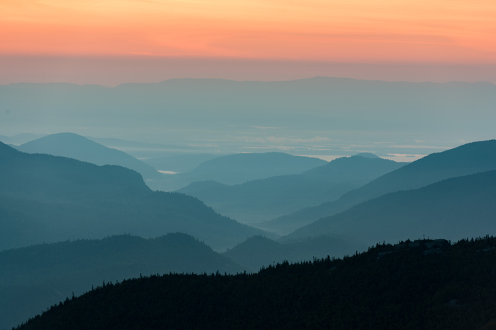
Jeff Herwood’s style of photography leans towards classical realism less so abstract. Within that, he enjoys documenting what he calls “Seldom Seen Scenes”. A break in the clouds after a rainstorm, a moment in dance, a sunset well after the sun has set; light interplaying with form. This entails early morning and late night hikes, inclement weather and above all else, patience. Living in a constantly changing world, the power of photography is its ability to isolate a moment in time that will never exist again. Moving through time each moment becomes a further distant memory. Ansel Adams spent as much time in dodging and burning in the darkroom not only to perfect his images but also to recreate his beloved moments in Yosemite, his time of creativity, serenity and great passion. Monet pursued not only stopping time but light as well when he spent two years painting the Rouen Cathedral dozens of times at different points in the year to capture its different light and mood. Even the seemingly inconsequential can become consequential when one can isolate those elements that we can relate to on an emotional level. Some of Herwood’s inspirations and influences are Georgia O’Keeffe, the Impressionists, Jamie Wyeth, the Hudson River School, F.L. Olmstead, Zaha Hadid and of course, Ansel Adams. (image: Sunrise, Cascade Mountain by Jeff Herwood (24″x16″; photograph))
Kari Meyer (Breast Care Center)
As an artist, Kari Meyer sees art as a form of communication that has a power beyond that of words. Through imagery, she attempts to portray ideas that words cannot, like the archetypal beauty that connects all things. She attempts to create a positive experience for the viewer, while also hoping to make a positive commentary on the world. Her imagery demonstrates an abstraction of nature. Her inspiration comes from nature and the Japanese ideals of wabi-sabi, a prominent philosophy of Japanese aesthetics. For Meyer, wabi-sabi changes the worldview of western civilization. Things we normally view as negative become beautiful. Loneliness, old age, and death become beautiful because they are inevitable and represent the constant flux of the universe. She attempts to address this idea of the movement of eternity, of everything either coming from or returning to nothingness. Her work urges the viewer to contemplate the relationship between oneself, nature, and the universe. (image: Opening by Kari Meyer (16″x20″; acrylic on canvas))
December 15, 2016-April 15, 2017
The work of Charlie Bluett, Mark Collier, Bruce Conklin, Emily Mitchell, and Kevin Ruelle. Curated by BCA.
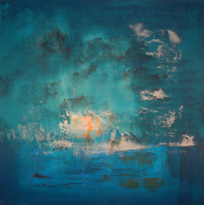
Charlie Bluett studied Fine Art at Eton College in the UK, and works from his studio in Vermont. His contemporary abstract colorfield paintings focus around scenes and objects we are all exposed to within America’s vast and varied environments. Contours, tones, colors, emotions, movement & natures balance feature heavily in his works, and they capture the very essence and flow of the world around us, inspired by the elements, the people and the habitats that combine to create it. (image top: The Lure of the Sirens by Charlie Bluett (36″x36″; acrylic on canvas))
Photographer Mark Collier entered the world of photography at age 10, when his mother, a Vermont school teacher, brought home a camera and darkroom kit in an effort to keep her chronically bored son occupied during Barre Town Elementary School’s long summer vacation. After spending the next two and a half months photographing everything in sight, Mark realized he had found his calling, and began to pursue photography in earnest.
After graduating from Spaulding High School in Barre, Mark studied photography and art at Johnson State College before enrolling in the adult degree program at Vermont College of Norwich University. His work was first published in the Washington World and Hardwick Gazette. From there he moved on to the Burlington Free Press and the Times Argus, later transitioning from photojournalism to commercial photography and digital image editing. His clientele included Sloan Marketing, Jager, DiPalo, Kemp Design, Burch and Company, as well as freelancing for about six years. In 2011, Mark returned to the Times Argus and his roots as a photojournalist. In 2013, Mark made to move to Norwich University, becoming the University’s staff photographer.
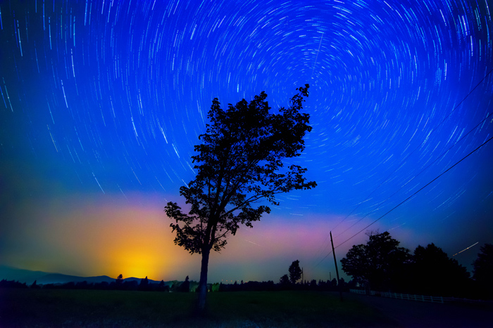
Mark is widely published, his photographs having appeared in The Washington Post, The Associated Press, CNN, Ski Racing Magazine, The Burlington Free Press, The New York Times Magazine, Architectural Digest, Elle Decor, Dwell, In Style, The Boston Globe, The New York Times, USA Today, and many, many others. (image: Star Trails by Mark Collier (12″x16″))
During my working life, I have been involved in various aspects of design and implementation. These have manifested as aerospace hardware design, graphic design, photography and illustration, museum exhibit design and, most recently, as a working chef. My days now are divided between painting in the mornings and cooking at Vermont Respite House in the afternoons. I am a self-taught painter, working primarily in the studio. My painting is heavily influenced by the Impressionists and by more recent painters as diverse as Milton Avery, Giorgio Morandi, Vilhelm Hammershoi and Avigdor Arikha. (image: Intervale, Late Summer by Bruce Conklin (24″x40″; oil on board))
Emily Mitchell’s approach to making art is centered around “play”–letting go of what might be “planned” and working with what is happening in the physical painting moment and blending that with her response to the world. When creating art, her heart, brain and soul are lost and mesmerized entirely in the process. She has found that ultimately it is play that allows her work to be true and lets her heart sing. Emily has a strong visual connection to nature, in particular pods, bubbles, trees, birds, and water. As her life has evolved to include her own family, she also observes and renders the idea of “home”. Above all she is exploring the human need to connect. (image: Hope Flies Free by Emily Mitchell (24″x36″; acrylic))
Owner of Ruelle Design & Illustration for over 30 years, located in Burlington. Kevin paints impressionist landscapes from New England, the Southwest and Mexico. His experience in commercial art includes: technical illustrations, book covers, book illustrations, packaging art, architectural renderings, illustrated maps, cartooning, faux vintage travel posters and decorative art. (image: Green Mountain Ridgeline by Kevin Ruelle (20″x60″; archival print))
8/15 to 12/15/2016
The work of Louise Arnold, Phil Laughlin, Julia Purinton, Judy Hawkins, Greg Danford, and Jean Cannon. Curated by BCA.
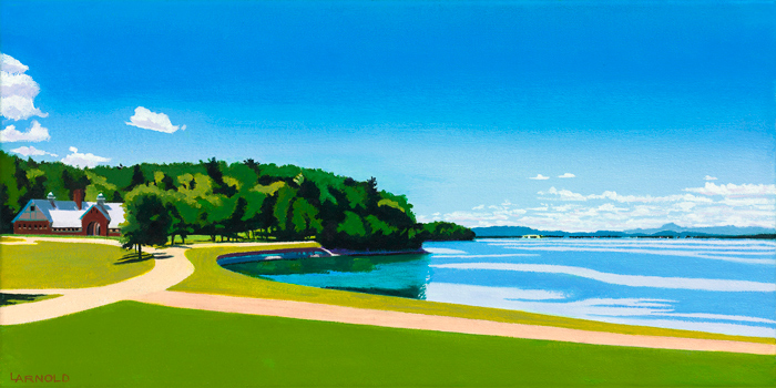
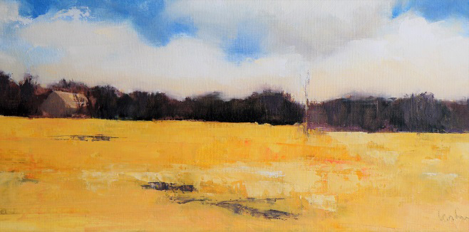
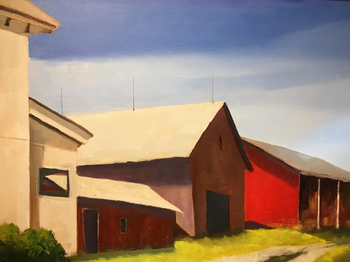
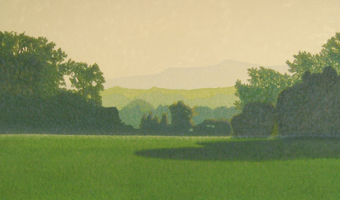
I am a landscape painter with a background in Landscape Architecture. I work both en plein air and from my photographs, painting in New England landscapes with which I have great familiarity. My subject matter ranges from mountains and streams to barns, abandoned farm machinery and cars, which are prevalent features in many of the landscapes that I paint. I am interested in capturing the character or spirit of specific places, and in exploring how the qualities of those places affect me as an artist working in them. The paintings that result have evolved from this exploration and engagement. (image: View to Coach Barn by Louise Arnold (12″x24″))
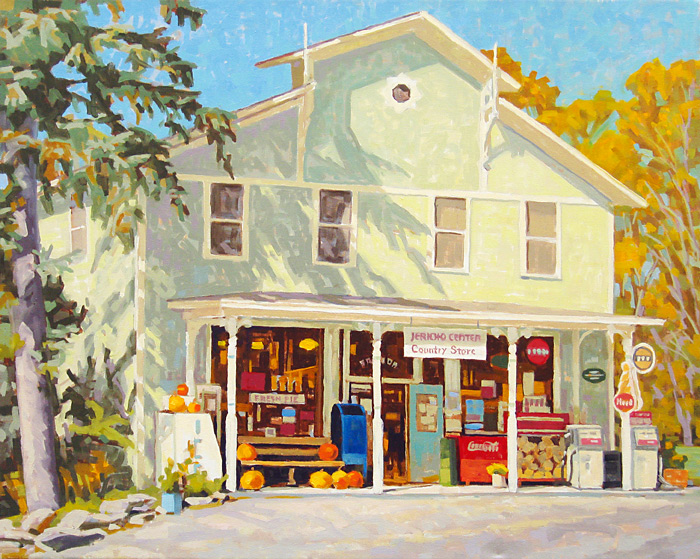
I take color and shape, raw materials with no intrinsic value and assemble them into something coherent that has the power and purpose to speak. If there ever were societies without art, we don’t know about them. It’s artists, through their art, that tell the future who we are. (image top: Jericho Country Store by Phil Laughlin (22″x30″))
As an artist, I am immersed in the distillation of landscape with narrative rather than purely descriptive intent. Utilizing a familiar vernacular of landscape imagery, I explore psychological passage and growth; finding joy, accepting loss, releasing regret. In the way that fairy tales dramatize elements of real life, my paintings illuminate aspects of personal endeavor. (image: Cathedral by Julia Purinton (30″x30″; oil))
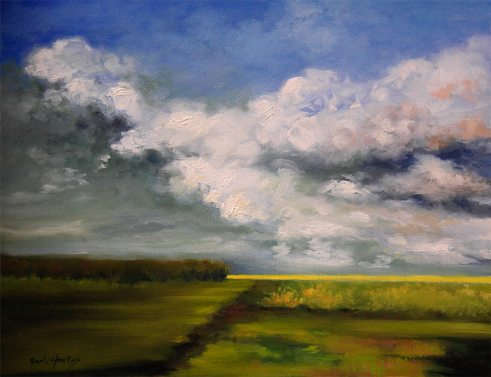
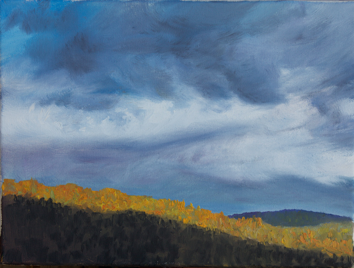
Judy Hawkins’ paintings are inspired by country drives looking at favorite marshes, fields and ever changing Vermont skies. She expresses her recollections in new paintings, exaggerating key highlights, beginning a painting at the top and working down, quickly establishing mood through color and composition. She allows the paint, drips and accidental color combinations to guide her vision to create the drama of weather, skies and water. (image: Follow the Light by Judy Hawkins (24″x30″; oil on canvas))
Greg Danford
I have always believed that the best investment you can make in your photography is plane tickets. So while I’ve been fortunate to live in Vermont, one of the world’s most scenic places, for 25 years, I’ve been just as fortunate to have traveled through Central and South America, the Middle East, Africa, and many part of the U.S. What hangs on these walls is a small sample of what I’ve seen along the way. Hope you enjoy my take on the world. (image: Silver Lake, Sliver Moon by Greg Danford (16″x24″))
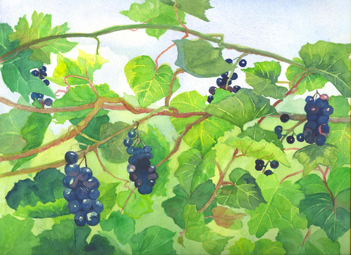
I am experienced in a variety of media. My work travels back and forth through personal interpretations of the natural world to curious statements from the subconscious. In terms of the landscape or interior, I tend to favor the close-up view or the odd angle.
I also paint from my imagination, synthesizing images from memory or making a stab at the profound, the mysterious, the ethereal. These paintings often express the intertwining or interconnectedness of people and the natural environment. (image: Grapevine by Jean Cannon (11″x14″; watercolor))
4/15/2016 to 8/15/2016
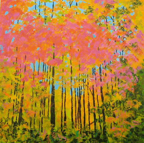
The work of Jennifer Hubbard, Mareva Millarc, Douglas Biklen, Lorraine Manley, Robert Gold, and Patricia LeBon Herb. Curated by BCA. (image: Autumn Canopy 1 by Lorraine Manley)
12/15/2015 to 4/15/2016
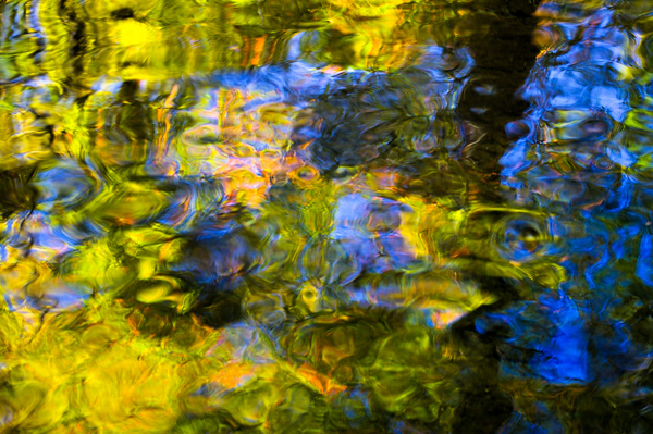
The work of Elizabeth Nelson, Lee Garrison, Jim Westphalen, John Snell, and Krista Cheney. Curated by BCA. (image: Reflections at Cady’s Falls by John Snell (17″x23″; photograph))